MECH Summer School 2008 from MECH on Vimeo.
Petra Bittl Exhibition
Here is some recent work the ceramicist Petra Bittl. It is a small exhibition in Leeds College of Art. The brief was have an image of her work with the text. I decided to zoom in on the work and dull it slightly so it appeared more textured and rough to mimic the pottery. This was aided by the matt print process.
A4 Matt Poster

A6 Matt Postcard


Here is part of the exhibition space. I think the choice of the Bodoni typeface reflects on the tradition and rawness of the exhibition, whilst there are elements within the type that still remain timeless in fitting with these contemporary ceramics.


A4 Matt Poster

A6 Matt Postcard


Here is part of the exhibition space. I think the choice of the Bodoni typeface reflects on the tradition and rawness of the exhibition, whilst there are elements within the type that still remain timeless in fitting with these contemporary ceramics.


New York

New years in New York City.

Had 3 days in New York, free of museums except the MoMa which featured the 50 years of Helvetica.

It gave me chance to investigate more of the city, soon realising it is the capital of Helvetica. But this clean and sharp concept was evident even when it came down to the clothes sales. In england we are used to seeing exagerated red posters virally spread across towns, with instore caos. New York however offered interesting shop window displays and instore signs which simply read 25% off everything. Easy.

When trying to fight my way to the Time Square ball drop i stumbled on this massive serif font of the New York Times Offices. It appears so powerfull and traditional set against its white background. Font is EnglishTowne-Normal. Definately a highlight of the trip.

Something also interesting was the advertisements on the subways, the positioning of the seats in the carraiges forces you to look up (unless you want to try stare out the person sat opposite you) which is where most of the adverts were positioned. This could be a good context for an advert for dating perhaps, getting people to make eye contact from after reading the poster.
Leads Media, Leeds
Whichever it is, i took mine on a walk down to Leads Media where i met up with Lee, a senior creative at Leads Design who are based in a converted mill down the bottom end of town. He gave me some insights into how the agency runs and had a look through my book at the same time.
Really helpful bloke, who said i should stay in touch and he would help me out with any issues i have with my work.
He's a keeper. See the agencies work here
http://www.leadsdesign.com
Really helpful bloke, who said i should stay in touch and he would help me out with any issues i have with my work.
He's a keeper. See the agencies work here
http://www.leadsdesign.com
Video
Here is the link to see what i got up to over in manchester. The experience was massively informing. It tought me a lot about the ways advertising approach work and it definitely informs my own design practice in terms of thought processes and ideas.

www.mechsummerschool.com

www.mechsummerschool.com
Made it.

After 2, 12 hour days working on a speeding brief and being stuck in traffic as a result of fog and a broken down car in the fast lane for 2 hours, then thinking I'm going round the M60 the wrong way (loop road) and a 15 minute presentation and another brief to promote athletes foot and being told its a tie break situation and having sleepless nights......
....and before all of that i tried filling out an application form on the Oblivion, river rapids and corkscrew at Alton Towers just to get the chance to do all of the above, i was finally told i had a place on the summer school at McCann Erickson Manschester.
Below is a piece for athlete foot powder. UPS: it removes athletes foot in 5 days.

McCann Erickson Application Form
I decided to make filling out forms more interesting........at Alton Towers


Letter Press
What a day,
Was a right do today visiting Evolution Print in Sheffield. It was a trip to go see the LCAD prospectus getting printed. It will be on the press for 48 hrs to do 25,000 copies. A massive job but when you get close to the huge machines you can see how it all works.
Tom showed us round the place and made a cracking cup of coffee. Cheers Tom.
Heres what i saw!


Evolution Print
What a day,
Was a right do today visiting Evolution Print in Sheffield. It was a trip to go see the LCAD prospectus getting printed. It will be on the press for 48 hrs to do 25,000 copies. A massive job but when you get close to the huge machines you can see how it all works.
Tom showed us round the place and made a cracking cup of coffee. Cheers Tom.
Heres what i saw!
The Experience
Some points on The Guardian
I learnt that i need a varied range of briefs to work on
I enjoyed the large office environment
Don't want to go to a 'trendy' studio
I learnt that i need a varied range of briefs to work on
I enjoyed the large office environment
Don't want to go to a 'trendy' studio
Guardian: Week 2 - Creative
Over the past 2 days i have been wondering up another flight of stairs and working in the creative department. It has been a slight contrast of the previous week working in editorial in terms of the though processes. Below are some ideas based on the guardians presence at glastobury festival. The images represent two seperate ideas that are in initial stages.
Idea 1:
The first idea considered how people are influenced by music. It becomes a foundation on which potentially influences their stories and memories. With this in mind i started to look up some of the potntial bands for the festival and searched through the lyrics. These were then used to invent humorous/stand and read stories. This was a different way of working for me. It tested some of my copy writing skills. This is something i should deffinately consider developing if i am choosing to work with type.


Idea 2:
I was given the initial idea of "its a bit like" to develop. It was a description of music. The though i had on this was how the festival goers would be individual so the idea of new music creations would allow for this to happen. I approached it in a few different ways.


This idea below would be addaptable to the Guardian Lounge in which it would become a giant magnetic wall in which people can interact with and invent there own genre. It would make for a photo-opportunity and would become a talking point at the festival.


Guardian: Thursday
I spent tuesday doing jobs for the family supplement which goes out on saturday. These were related to the weekly comic inside.
Yesterday Sarah gave me the job of laying out a double page spread for the travel supplement. The layout challenged the point of the viewers interest, but keeping an order on the page. These included things like
The text fitting square
Relationship between the images
Making sure the pull quotes stand differently to the cross heads
Lining up of the images to suite the grid
I have started to pick up on some of the Guardian style. Though i am sure there is a lot to learn. Yes there is.
Should be getting the password to the online archives of the newpaper.
too much to handle
Not sure if this is graphic design related but its deffinately a form of visual communication. I have a big problem with doors in public that put handles on the push side. At least give some clear communication, please. It saves you looking like a berk and feeling stupid.
Guardian: Getting started

I have only ever been to the city on a casual visit, so it is interesting to see how my passive nature fares up when i have a real purpose to be here. That purpose comes in the form of a work placement at The Gaurdian.
I arrived at the new building on York Way near kings cross to be greeted by the new way finding system Cartlidge Levene. The bold logo hits you on the approach. After a quick tour i was taken to my desk and given some layout jobs to do for the day. These were for the comic supplement in the saturday paper. Was a steady day, found my feet a little.
It was interesting to learn how the paper comes together and there there are 5 editions printed throughout the night. On the front page you will find a series of stars that represent each issue. ***** <---- this would be the 5th edition. The latest.
I have asked to see the newpaper archives and managed to get another week placement planned, so i am here for 2 weeks.
Excellent.
Stass Paraskos
I recently got commissioned to produce a postcard and poster for the the college. It is an exhibition to show the artwork of Stass Paraskos. I spent 2 days on the project. An A4 poster,

An A2 version

Some of the early developments were based around incorporating the colour of Stass Parksos's work. I felt these didnt represent his work shown in the exhibition so i took a different approach. The second approach was to incorporate the signature of Stass. By making the signature large i wanted to show that the background image was only part of his work. This helps to show that the background image is not piece of work.


The design was also transferred onto an A6 postcard. I kept the same type layout for the back, so it reflected the rest of the media. The type has worked well across the scales.

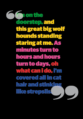
Everything is extraordinary
This began as a project for creative networks which has developed into a bit of an experiment over the past few days. Think this is my new favorite font. Riot squad NF. The work is part of an ongoing development of me being able to work freelance. The work started in illustrator then was developed using some layered techniques in photoshop. Not sure what else to add to it now, to make it more realistic as gold, so i think i will keep at this for now.
It could be developed as by using some more light techniques.


It could be developed as by using some more light techniques.


Treating type
I have recently being getting flamboyant with the help of a bit Wham. It was an extention of what i was working on for the creative networks. I have started to use a different technique, using less texture, but more shine. Still potential for further development. Will possibly use it as poster for promotion.


Subscribe to:
Posts (Atom)